
Blancmange, Fractals, Hedging, Excel and Python
Converting an Excel hedging model to Python
One of the highlights of recent issues of the Actuary magazine was the excelllent article "Taking shape: the Brownian blancmange’ fractal and how it can be used in hedging" by Andrew Smith and Oliver Bentley.
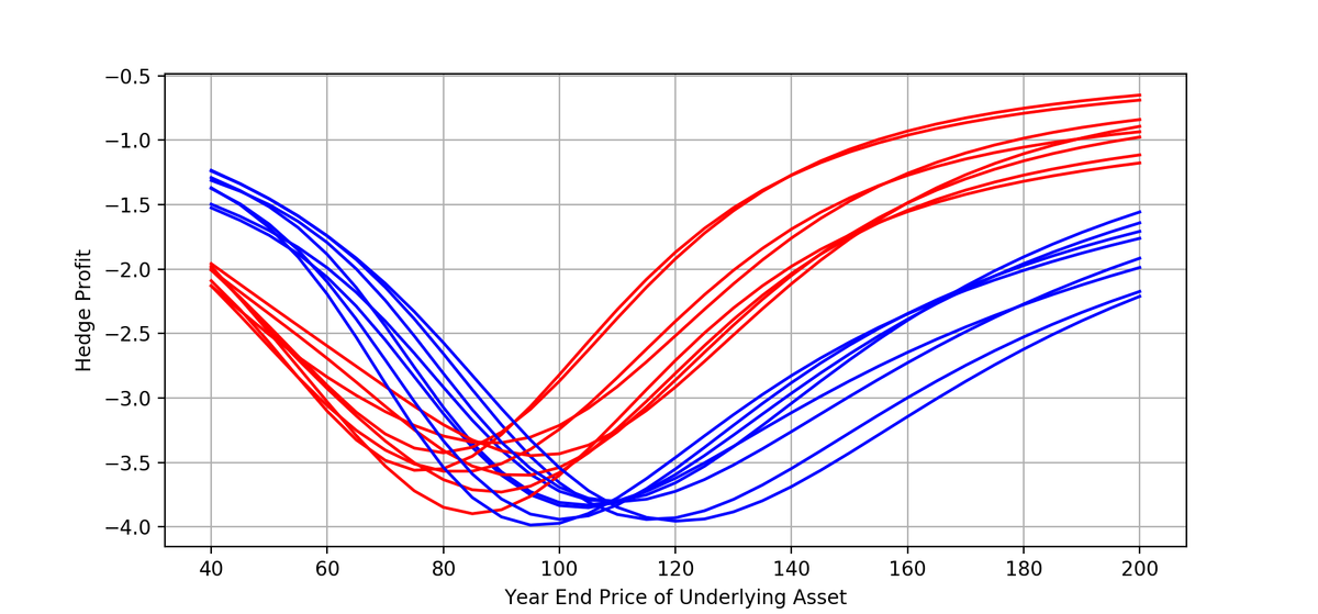
In this paper Andrew and Oliver show how to construct paths that are similar to those produced by Brownian Motion but which can be generated deterministically with predetermined endpoints and volatility.
In order to do so they propose a new fractal curve 'Brownian blancmange'. The curve is Brownian because it resembles Brownian motion and blancmange because it has a property that resembles 'Takagi’s blancmange fractal'.
Andrew and Oliver go on to propose this curve as a tool for stress-testing strategies for dynamic hedging. I'd strongly recommend the article for those who are interested in exploring this approach.
Along with the paper Andrew and Oliver helpfuly supplied an Excel workbook with accompanying VBA code.
With our focus in this site on using data science tools, the obvious questions are how easy is this code to convert to Python and how do the two versions compare?
An Excel workbook has some advantages over pure Python code: it enables distribution of code, data, numeric results and graphs in a single shareable file.
So for a Python based version the obvious approach is to use a notebook, which also allows distribution of all these elements in a single downloadable file. So how easy was it to create a Jupyter Notebook from Andrew and Oliver's workbook?
Excel to Python
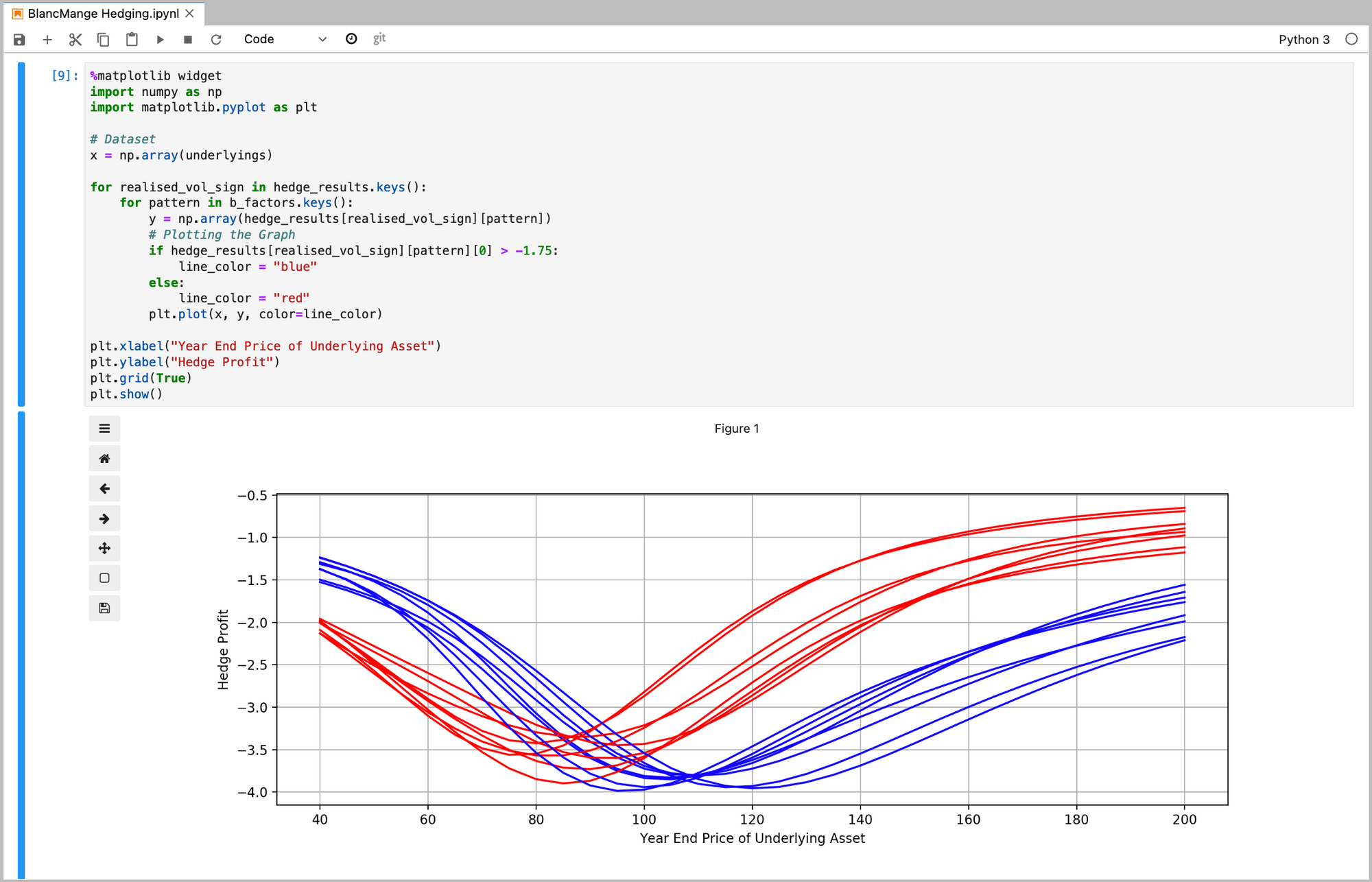
The first task was to convert the VBA to Python. VBA and Python have lots of syntactic elements in common with differences that can easily be identified and corrected. Overall, it took about an hour to generate a working Python version of the VBA code.
There are some minor catches in going from VBA to Python. One that is easy to miss relates to loops. The VBA code:
For j = 1 to nsteps
Next j
loops nsteps times. Wheras the Python code:
for j in range(1,nsteps):
    pass
loops nsteps - 1 times. So we need to adjust the limits for the loop in Python.
A notebook version of the Python code is available on Google Colaboratory here and a version is also available to download here:
So how to the two versions compare? The code in the Python version is marginally more compact, and it's presentation is somewhat more transparent as everything is immediately visible in the notebook: no switching to the VBA editor is needed.
On the other hand it's easier to inspect numeric results in Excel. Also, the code to generate the graphs, using the Python matplotlib library, is probably somewhat more complex to develop than the process to generate these figures in Excel.
In conclusion, this is a simple workbook, but converting to Python was very straightforward. Using a Jupyter Notebook enables distribution of data, code, results and graphs in a single file in the same way that an Excel workbook does.
Thanks to Andrew and Oliver for their fascinating article and work on this topic. Any errors or omissions in the conversion are, of course, entirely my own.
Please subscribe to receive email updates of future posts, using the button on the bottom right.
Please also get in touch if you’d like to discuss any topic we cover or share how you're using data science tools in your work: contact details are on the 'Contact' page accessible through the menu at the top of this page. Or alternatively share your thoughts in the comments below.